The Bold and The Italic
Website Design and Digital Campaign
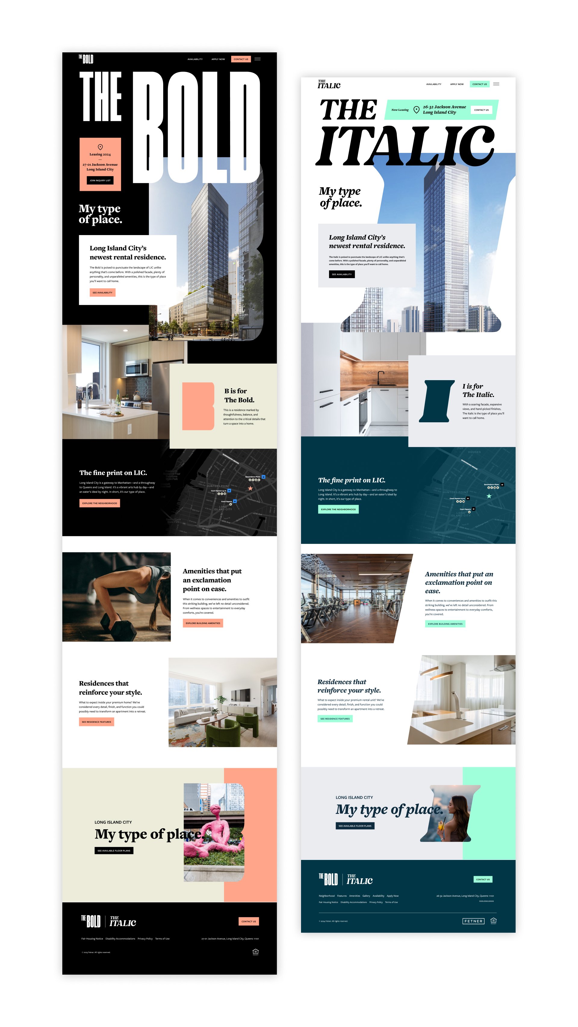
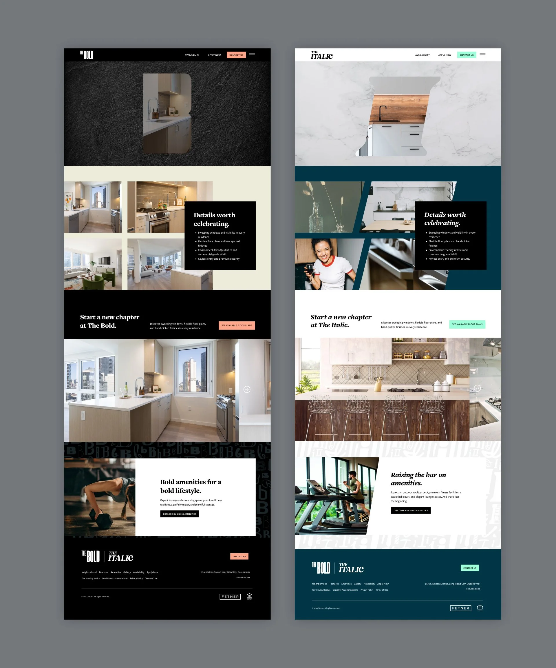
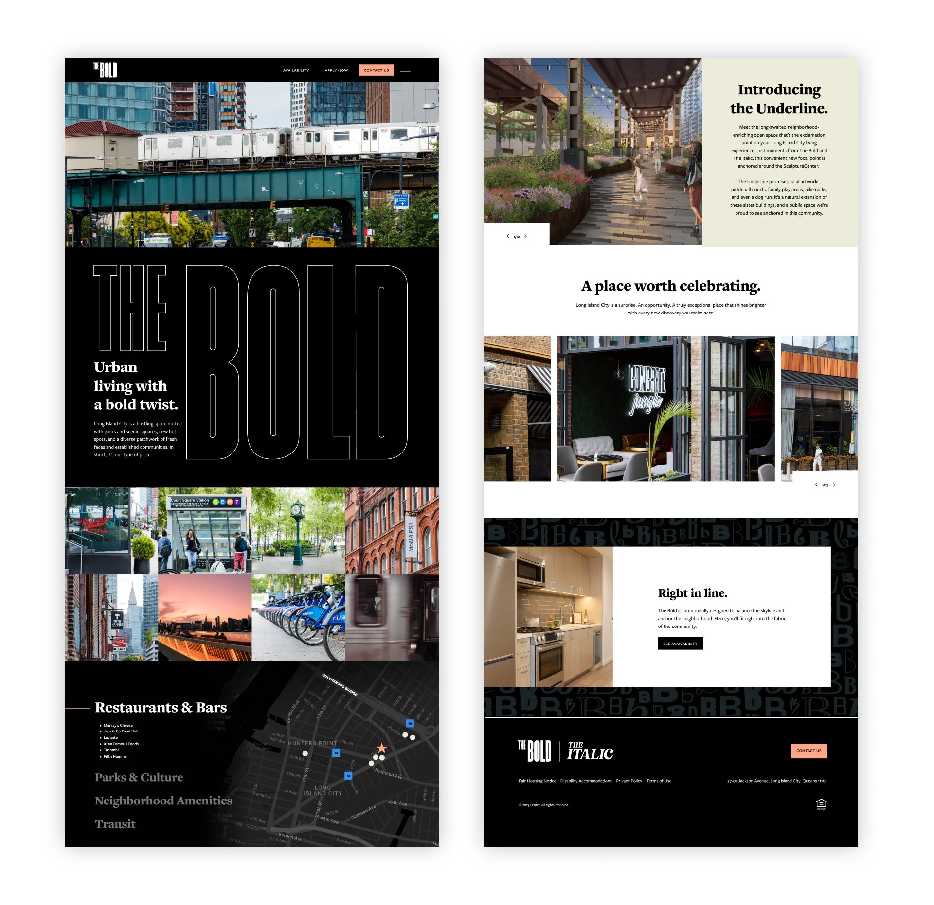
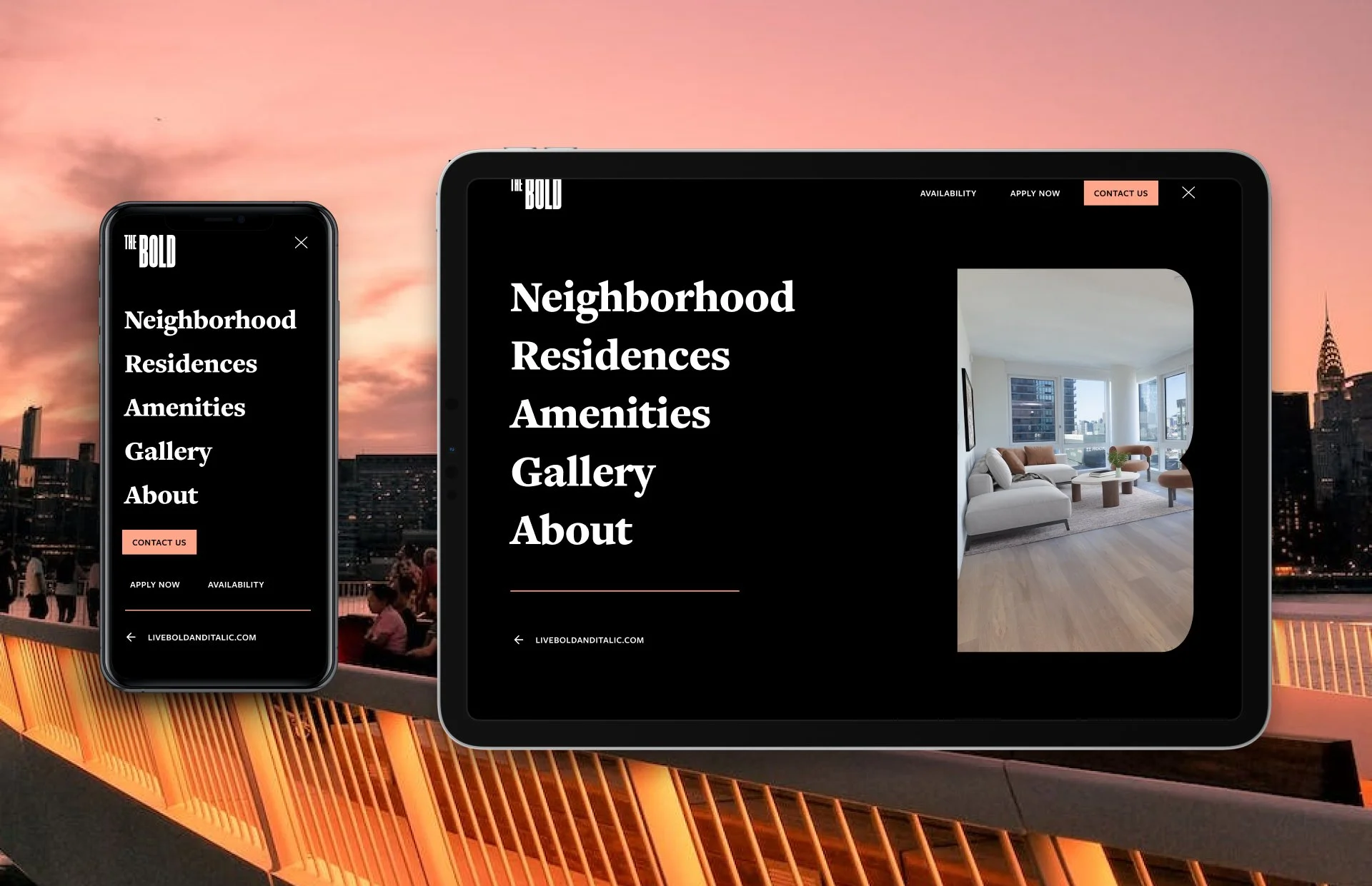
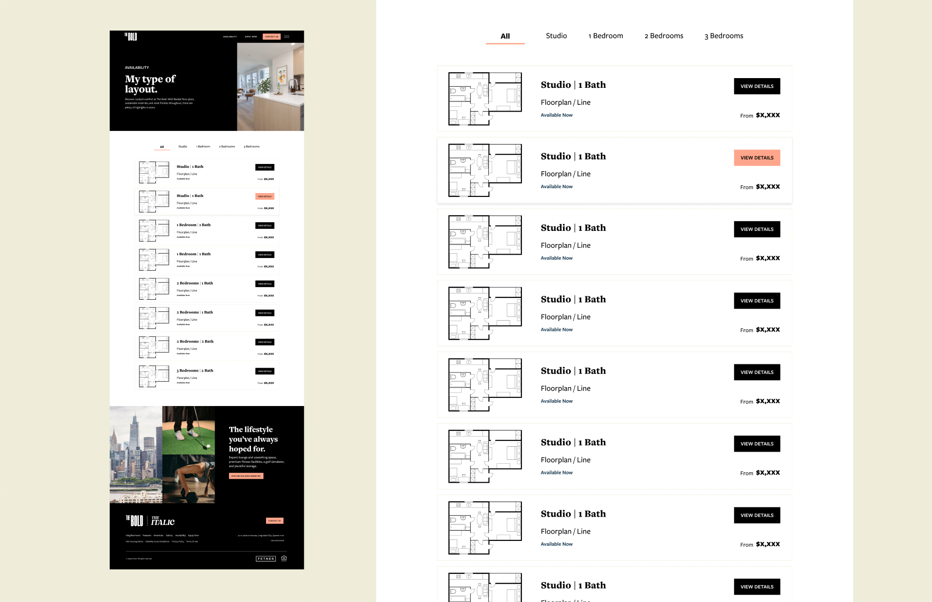
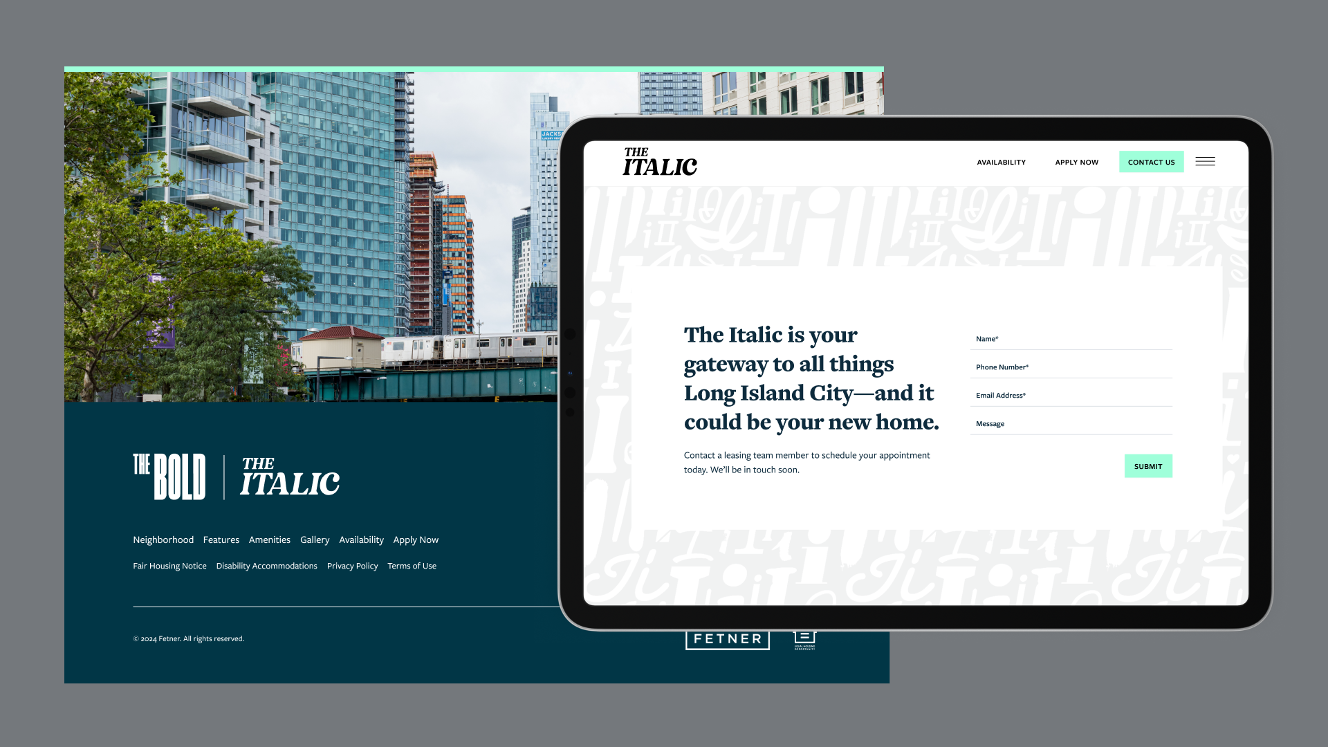
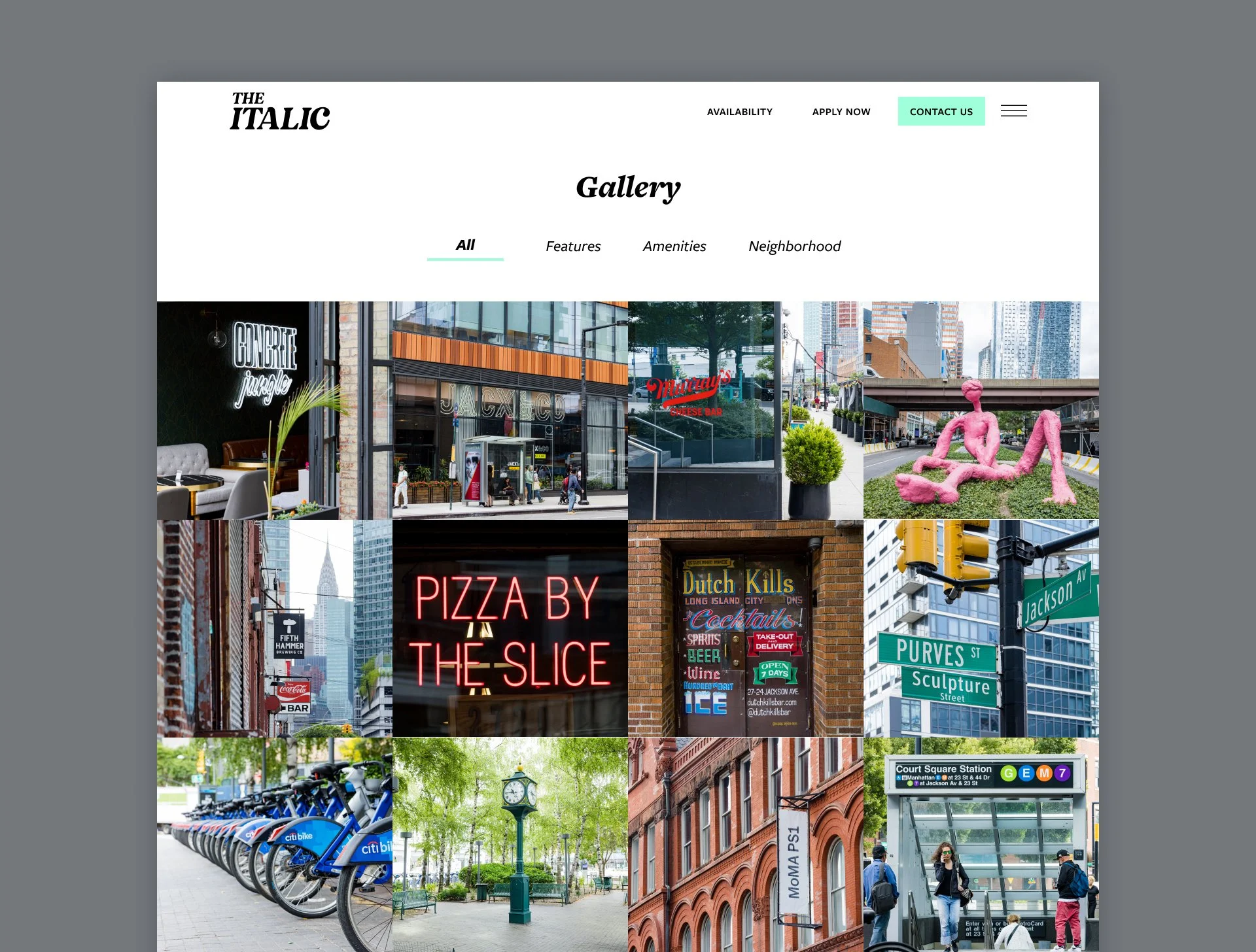
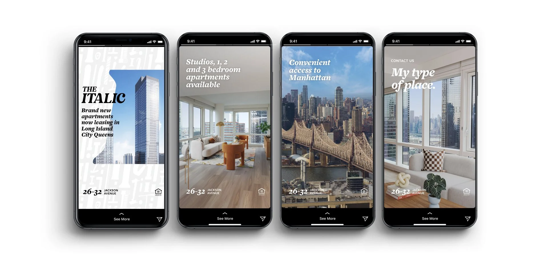
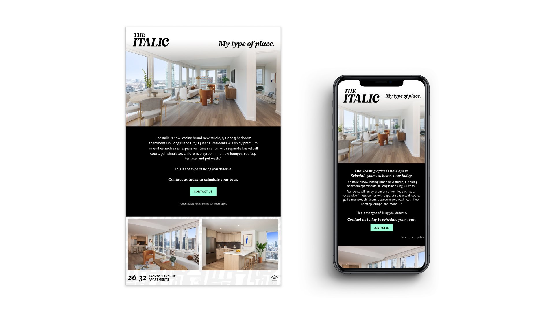
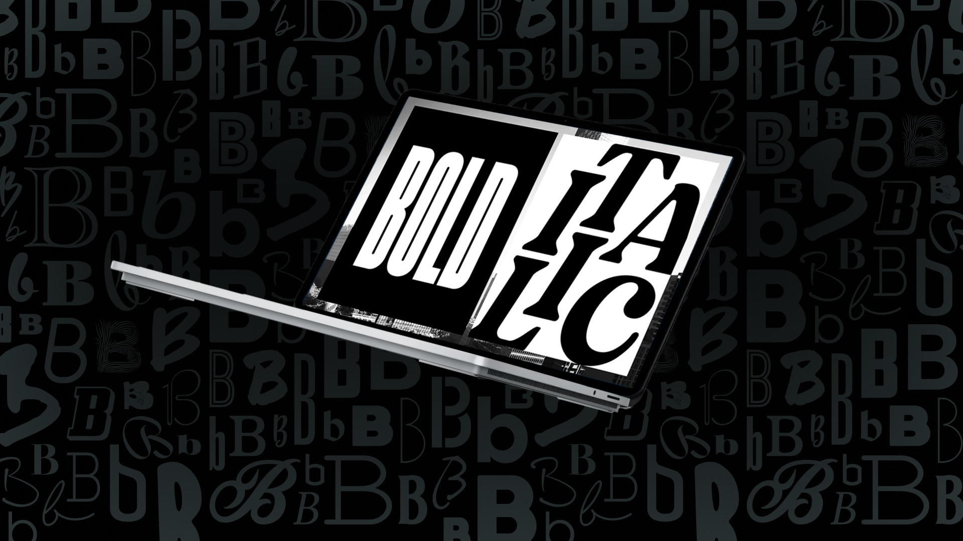
Meet The Bold and The Italic, Long Island City’s newest luxury rental residences. Sister buildings with sister websites, joined by a shared landing page. While the dual brand was created to highlight best-in-class amenities, it marks a strikingly different approach that stands out in the residential real estate market.
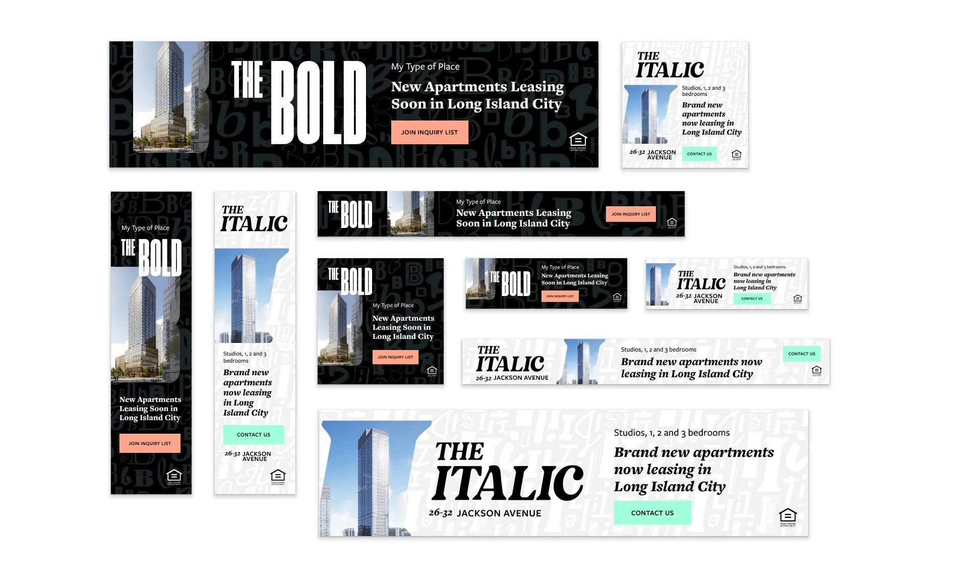
With opposite color palettes, but shared fonts and patterns, the brands can work both together and individually. Accommodating a staggered launch timeline, it was important to tell both sides of the story, while always driving our inquiries to take action. Digital and social media ads drove traffic to the landing pages where they could see themselves in “My type of place.” A steady email campaign further nurtured leads, resulting in over 500 building units leased at 100% capacity—before the target date.
Web Design | UI/UX | Campaign Design
Agency: Contrast & Co.